Part 1: Internal workshopping


My time at Ibotta was great and immensely valuable to me as a designer. I had a great manager and my team that I led the Mobile App initiative space with was phenomenal. My time there was divided between overseeing the flagship mobile app experience and several internal initiatives to help with engineering testing while we rolled out a very large program with Walmart. I also had the opportunity to mentor junior designers and help build out our team as many seniors had recently left.
Hearing that your app is hard to use in not an easy thing. It tugs at the very purpose of our livelihood. It is however, an opportunity. As the lead designer for the mobile app experience, I jumped at this opportunity to re-envision the experience and provide more value to our users. Additionally, the Ibotta mobile app is the flagship experience and will help shape the way other avenues and products are designed. This was a high stakes project with many stakeholders that allowed me to showcase my communication, strategy, research and design skills.
From the fist day I started at Ibotta, I had heard feedback that the app experience was hard to use. Over the years, Ibotta had introduced more features and functionality to its flagship experience of finding offers and redeeming them for cash. This had a way of obscuring that simple idea of opening the app, finding things you were interested in and adding them to your list. With this project, our North Star was tailoring the experience to that core flow. We had a few hypotheses on how to do that and tested them to see our way forward.
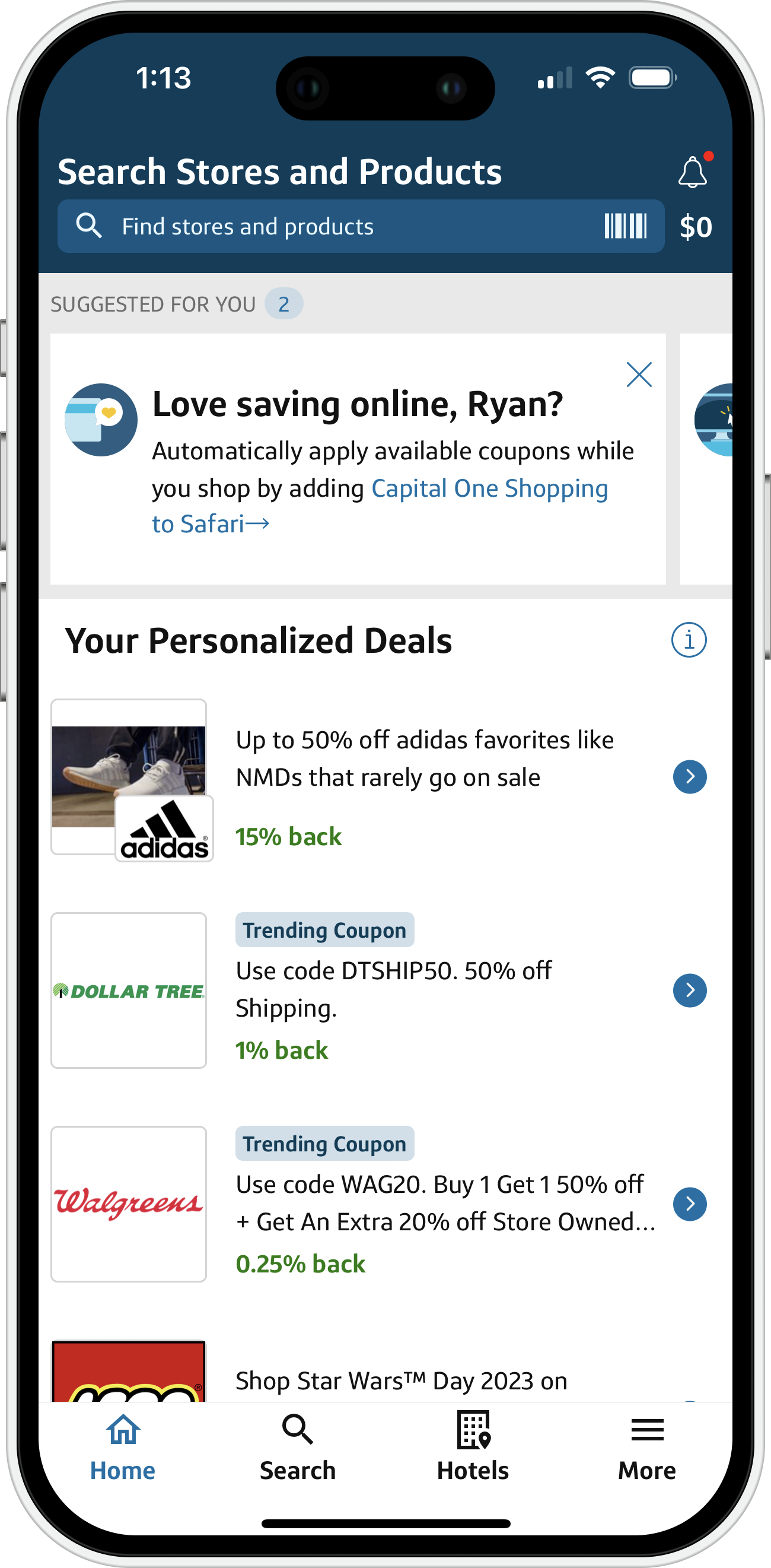
Our retention rate was below our expectations and what we had heard from users is that it was difficult to understand the app experience. This played out in several initiatives (including an onboarding flow) the largest of these being this project. Below is a chart produced by our internal Marketing Research team that highlights the lag in perceived “simple”-ness of the Ibotta experience versus our competitors. While 75% isn’t bad overall, the fact that we were so far behind our competition was both puzzling and irksome. This was our motivation to pursue this project.


The Ibotta product teams worked in the Triad model so I was in constant contact with the Product Manager and Engineering Manager within our scope of product. We held weekly meetings to discuss the roadmap, current work and any relevant feedback from prior launches. I really loved this team and our collaboration was top notch. Trusting your team and knowing that everyone is an expert in their field allows for fluid discussions and blurry lines between our disciplines. I love and encourage all to give UX/UI opinions and am always ready to give feedback to engineering and the business side of things. As a team, we were super dialed in to our users and also tried to keep a pulse on the industry at large. As I mentioned above, the mobile app is the flagship experience within Ibotta and so we had to work as a cohesive team. We routinely presented to the CEO and CTO to validate ideas and strategies. I was also beholden to our design team which kept a high bar for expectations. Lastly but most importantly, our user base is large and very vocal. We kept them in the loop and conferred with them throughout our process to make sure we stayed true to their impressions of us.
Getting to work.
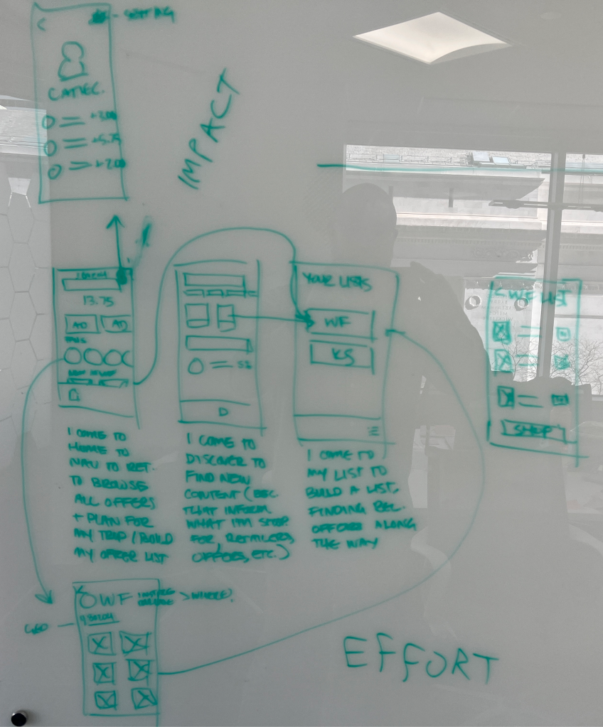
Through our internal and user conversations, we narrowed our focus to three concepts. It was my job to create the high fidelity mockups and prototype them. I was also very hands-on with our team’s UX Researcher throughout the project.
Coming out of our internal workshops, we had a few basic but powerful principles to guide our work. These led to specific initiatives within the designs such as (but not limited to) rethinking our bottom nav and getting our users to the main content. Adding a Discover home screen that would serve a number of purposes. It would take preferences into account (whether those were specifically set by the user or leveraged by our data) to present relevant offers in a pleasing way. We also added an In-store mode that was still in the works from a discovery standpoint but seemed like an obvious way for us to surprise our users where they are most likely to use our app.

We used a standard open card sorting exercise to level set on how our users think about the different aspects of our experience. This allowed us to focus on those top priorities and streamline the app experience to get our users where they wanted to be. One thing became clear. There was a distinction around Grocery offers, which were the main driver for the app, and Affiliate offers, a site-wide offer that requires multiple steps outside of our app to redeem.

One of the things we wanted to test was the impact of removing affiliate style offers from our app. Affiliate offers are site-wide offers that require a browser to be launched within our app and then the user needs to complete a shopping trip in order to receive credit. We’ve heard a lot of feedback that says this experience is not great and it’s not a significant driver of offer redemptions within the app. We were testing whether or not it would make sense to only have those offers available on the web experience while streamlining our app to a grocery-only flow.


The next option very clearly separated the Grocery section from the Affiliate section. We hoped to get insight into this mental model and if we could keep the affiliate offers within the mobile experience to have a clear space so that we could continue to target its particular differences when redeeming offers. This allowed us to bifurcate those two different types of redemption and optimize for each.


The Hybrid approach is similar to what the current app provided by mingling Grocery and Affiliate offers throughout the experience and allowing the user to make the distinction between them. I also took the opportunity with this version to explore an idea with lists that we had been working on in parallel just to get some initial feedback. This was a list that was not attached to any particular store (think of it like a list you’d make in your Notes app) for general shopping needs but we could then pull in offers that matched those keywords and allow our users to add them directly from the list instead of using the store as the entry point for offers.


Let me preface this section by saying all the feedback, whether it was directly critical or circumstantial in its criticism was (and always is) immensely helpful. For this particular endeavor there was a mix of people saying the navigation direction seemed wrong, or that they had tried to do a dedicated list tab in the past, or that removing affiliate offers totally was a very, very, bad business idea (and also a potentially really good one!).
Throughout our discussions with the C Suite through to the design and product teams, it was clear that this endeavor seemed risky. Potentially tipping over what’s essentially the companies cash cow created a palpable feeling of anxiety in some of these meetings. I definitely learned to deal with these concerns and criticisms in a productive way by gathering people together, getting buy-in through communicating design and our research & insights. It also gave me many threads to follow and do more research and talk with more folks about the origins of some of these worries. As well as talk to those who were a part of previous initiatives that either were successful but petered out or failed from jump. It gave me and my team the ammo we needed going into the next phase, which was presenting these concepts to our users.
Quick, universal access to the List functionality was the most popular
9/10 participants said they wanted the list functionality on the bottom navigation in a new upgraded design. The Universal List was well received but would need considerable UI improvement to make the function more intuitive.
Savers want to customize their content with lifestyle preferences
Content on the homepage should be catered to lifestyle - Savers expect to be able to set preferences during onboarding or in profile/settings. Features like “Buy it again” are well received because Savers expect these algorithmic features.
Savers are looking for quick access to offers related to recent purchases
Participants were overwhelmed by the discovery content on the homepage at the top, but wouldn’t mind seeing it below the fold. In designs with less content on the homepage, desired sections like “Buy it again” were more easily noticeable.
Tab bar
7/10 participants favored a bottom navigation catered towards core functionality of the app (Home, Stores, & Lists).
Exposure to both affiliate and grocery on the homepage.
Within the Store page, category division of Grocery vs. Retail vs. Etc page was well-received and easily understood.
What didn’t work
A Grocery Only design was not favored by Current Savers because they like to see the extent of Ibotta offerings.
It was not obvious to Current Savers how they would navigate to offers with a Grocery vs Retail split on the bottom navigation.
Next Steps
Identify most intuitive nomenclature for affiliate vs item-level.
Continue to test multiple variations, isolating offers/content as the primary variable, on overall IA and navigation.
Test with existing AND new savers, as existing savers already have a ‘mental model’ in place.
“I’m a creature of habit for sure in terms of consumption... I buy the same random oat milk...we usually already know what we’re gonna get”
“It's nice when a store sort of recognizes your purchase behavior and says ‘Okay, we know you're probably gonna buy these things, why don't you come back to us and we'll give you, you know 20 cents off all the product’”
Onboarding/sign-up
Participants suggested that lifestyle preferences can be identified during the onboarding and sign-up process to filter content immediately.
“[On how he would like to personalize content] having those personal checkboxes that it can be more stuff like that... as I’m signing in and setting up I’d like to check those boxes”
Settings/Profile
As a means to filter content once you see what the app has to offer, participants would expect to be able to set their lifestyle preferences so they don’t see unrelated content to them.
“Perhaps something that you can you can adjust in your profile.”
“I would expect me to go to like account preferences and then maybe select and customize it down with there”
“It shows me that Ibotta understands it’s shoppers... I think that that the way that list functionality was designed supports that way of shopping and I thought that was run really, really nicely I like that a lot.”
“I like the multiple lists because... I can get the lists all together, all at once, for different stores”
“It's incredibly useful it allows you to make your shopping list...allows you to make your shopping list task a lot more efficient... you won't have to be cross checking"
Improvements to the UI
Store-specific lists matched Saver expectations with additional praise on the product images and categories.
Savers like that they don't need to go into individual retailer to find lists.
The universal list UI was confusing and the function of the page was not initially obvious to Savers.
Pain points with the Universal List design
The Ibotta logo as the entry point was confusing and made participants think the list was only of Ibotta offers.
Add button was not distinct enough.
Not sure what the list was for (Without “My” Shopping List, there wasn’t a great feeling of customization).
“I hate baking but I love cooking Indian food, for instance, that would be a really neat way to sort of being able to personalize the homepage.”
“[About the recipe] Its kinda a shopping inspiration, spontaneous thing... kinda a cool feature.”
“Don’t want to see a non-vegetarian recipe on the first page itself, so that the the app loses my interest right there from the homepage.”
Savers were pleasantly surprised and excited by the new visibility and functionality of the list feature because it allows them to easily access their added offers and plan for trips.
Savers expect the app to use location & shopping history to personalize offers but they are also looking for a way to manually customize lifestyle preferences.
There is still confusion about sitewide % cashback and item-level offers, but Savers liked having a mixed content homepage to see both retail and grocery. There is interest in having split flows within the experience when adding and looking for offers.